Written by:
·
Reading time:
minutes

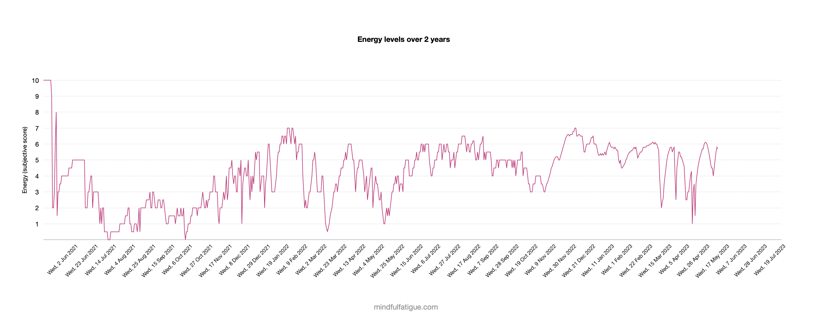
Having covered the process I use to track my energy levels, I’d like to share my actual chart.
It covers 2 years, so it’s quite condensed and a bit difficult to read (you may have to zoom in, sorry!). Fortunately, the aim isn’t to pick out details, it’s just to show what uneven recovery can look like in practice.
Everyone’s recovery is different, so it’s essential not to compare my specific energy levels or progress with yours. The frequency and duration of peaks, troughs and plateaus isn’t relevant. Instead, I hope it’s helpful to see that while recovery often feels like a rollercoaster at times, that’s completely normal.
My energy levels are shown on a scale from 0 to 10, which locates me roughly in the standard categories of ME/CFS, of Very Severe (0-1), Severe (1–3), Moderate (3-7) and Mild (7-10). The smoothing out of the chart around two-thirds along is because I switched to tracking with decimal points, instead of just half points.
My chart start from just before I first got ill, where I’ve shown a week or so of normal life energy (10 on the scale). I then had a brief illness, which I partly recovered from before collapsing in stages over a few months until I was hospitalised. Since then, there have many events over the last few years that explain some of the ups and downs on the chart, but as the specifics aren’t the focus, I won’t go through them.
The main aim of the chart is to monitor the trend, and my overall takeaway is that after a long period of instability, my levels have stabilised over time in the Moderate range. There have been some dips and nasty crashes still, but I’m able to return to this level afterwards.
I find the chart helpful to allow me to compare what I did at the time with the impact on my energy levels, which helps me with pacing and has built my understanding of what I can and can’t do, and how that fluctuates. There are also things that have a big impact that we can’t control, like illnesses. There have also been many times when I haven’t known what caused my energy levels to dip, which is deeply frustrating, as you’ve likely also experienced, and at these times I try to remember that that’s normal even for people without ME/CFS.
The chart shows the journey I’ve been on. Even though it’s been a pretty awful time, especially the early crashes, I still find it valuable to look back ever so often and see where I’ve been, even if I’d prefer to be at higher energy levels.
It can be upsetting if it seems like you aren’t recovering, especially if you have a downward trend, which I had for a long time. Take the time to remind yourself that you’re doing really well despite the challenges you face. It can be a long road to recovery but your efforts will pay off.
My chart also gives an indication of what to do next. I prefer to set smaller goals, a step or two ahead, that feel manageable.
My main aim is to have periods of stability, which I see as the foundation to building up my energy reserves. I’m also aiming to move up to the bottom of the Mild range, by reaching and stabilising around 7 points. Having only reached 7 points once, 18 months ago, that would be a significant achievement, and I’m looking to get there through patient pacing and calming of my system.